| H-E-B Grocery
Cart & Checkout
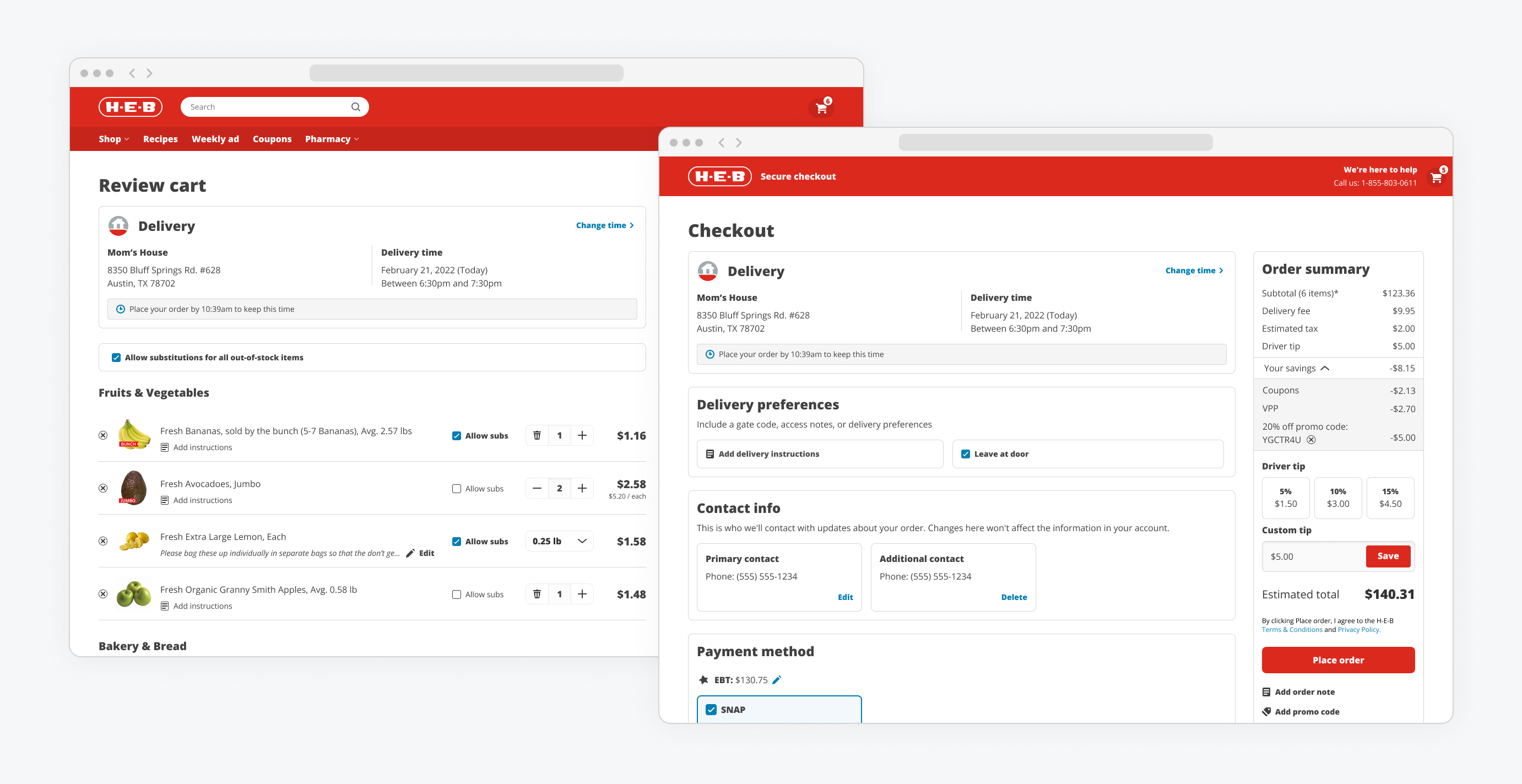
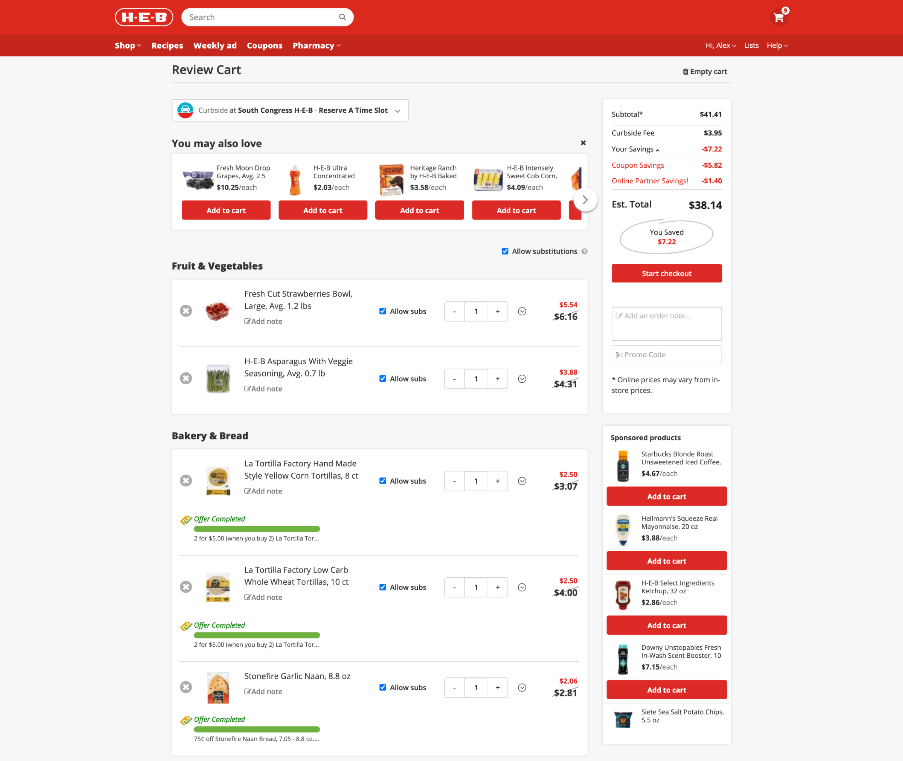
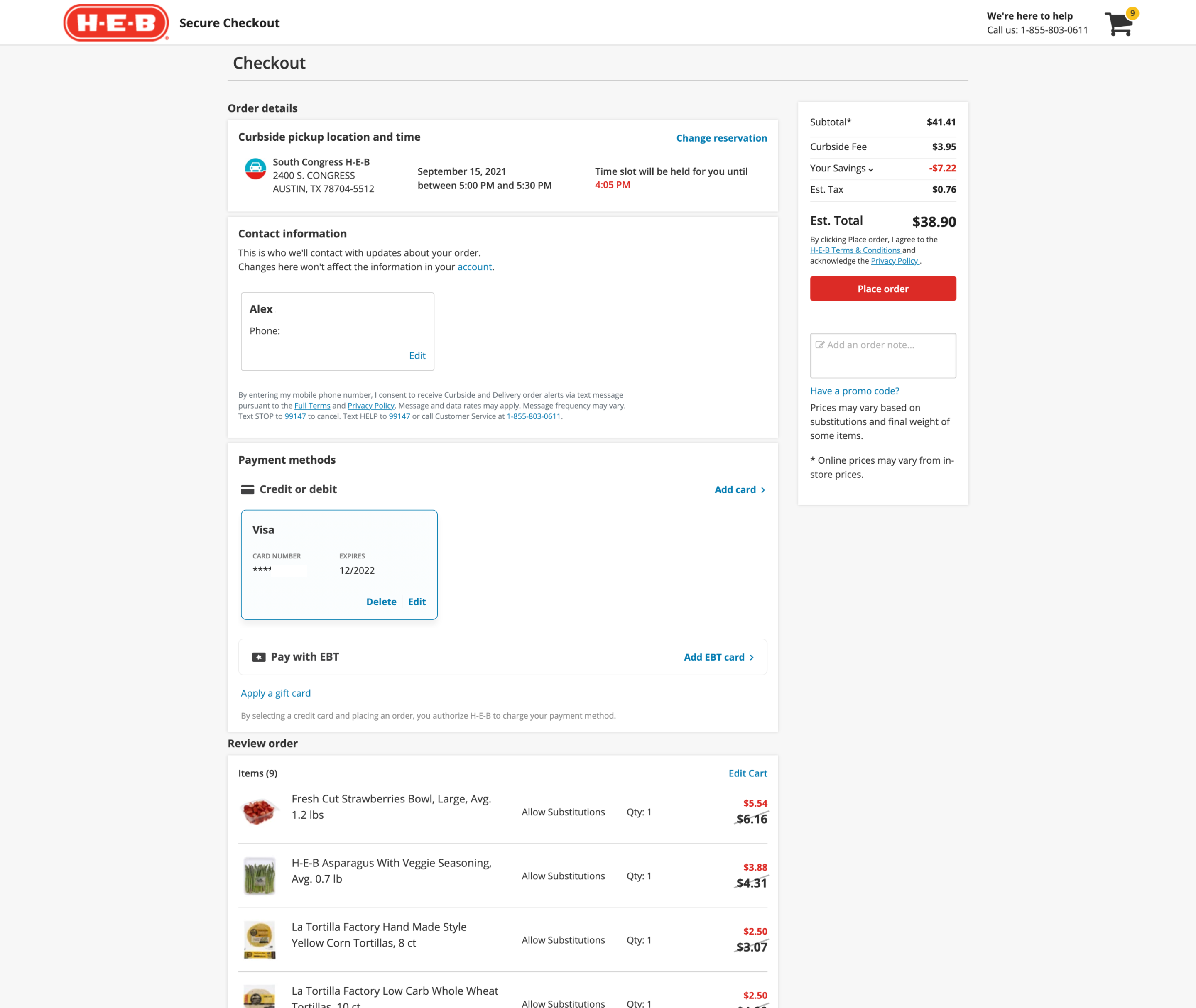
During the H-E-B website's migration to React, we revamped the Cart & Checkout experience to align with our app’s design language. We improved the grid and layout, updated text hierarchy, icons, and colors to enhance both accessibility and consistency.
Product Designer - Web Design System
Product
Design & Research
Engineering
The designs that were live in production were not aesthetically cohesive with the rest of the web experience. In addition to this opportunity to update the visual design there was an opportunity to address some usability issues.
Previously there was no source of truth for Web designs. Designs for Web were scattered across various files with no unique components and a lack of utilization of the Design Library System.
I kicked off this design by reading through a Heuristic Evaluation report completed by our Research team on the Cart & Checkout experience. I continuously referenced this report when designing for the updated Cart & Checkout experience.
I created a Web Design Library. I made sure to use the tokens from our native Design Library System for colors, iconography and more. I used an Atomic Design System structure to build out components. I then made Page Templates for the most common scenarios.
I walked through designs of the new Web Design Library with engineering.
I led design QA as everything was getting built. I annotated differences between the designs and builds.
Creating this Web Design Library allowed our team to have a source of truth for designs. Additionally, this improved our team's velocity by allowing us to quickly grab what we needed from this library and iterate faster.
Projects
.png)
Led design for the 0-1 experience of choosing a 3% monthly cash back category with PAyPal Checkout for the summer in UK.
Led design for the 0-1 experience of choosing a 5% monthly cash back category with the new PayPal Debit Card.
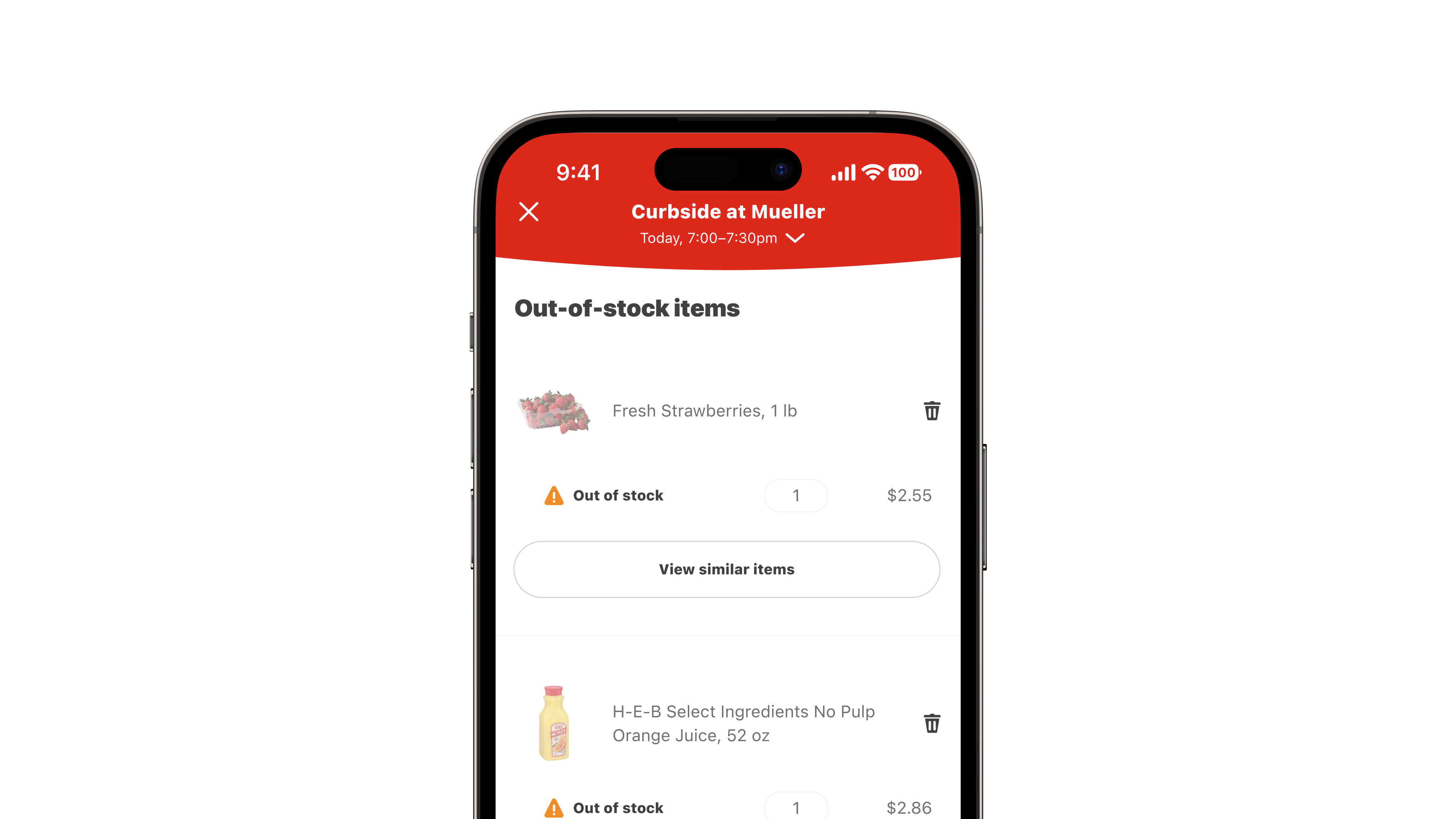
From MVP to V2. Designs for an out-of-stock experience with an estimated $5 million bi-weekly impact.
.png)
End-to-end design of an order tracking experience for ~2 million monthly Curbside & Delivery orders.